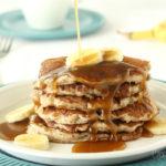
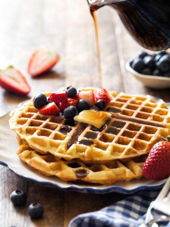
Waffles For Two
Wake up to the smell of a warming breakfast with Waffles For Two! They’re small batch waffles made with buttermilk that are golden brown,...
Read More Waffles For Two
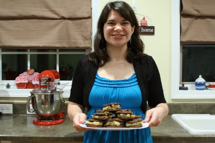
I’m Carla, a 30-some childfree woman from Pittsburgh who’s sharing recipes for two and small batch recipes made from scratch because not everybody cooks for a crowd.